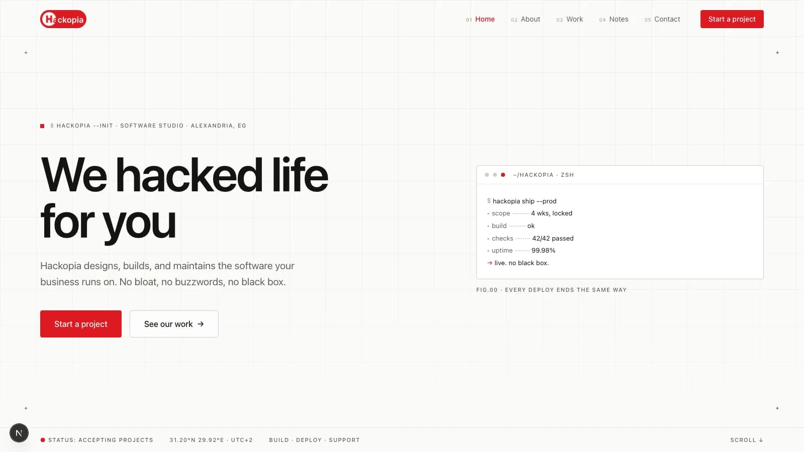
Every software studio's website looks the same. Dark gradient hero, floating 3D shape, three feature cards, a testimonial carousel, and a headline that says "we build digital experiences." We know because ours used to. This note is about how we rebuilt it, and the rule that made every other decision easy.
The problem
Our old site had a Three.js scene, a Spline embed, and a dark mode that inverted itself on prefers-color-scheme. It looked impressive in a screenshot and generic next to any other agency site open in the next tab. Worse, it argued against our pitch. We tell clients "no bloat," then handed them a homepage that shipped a WebGL runtime.
So instead of a mood board, we wrote a ban list.
The work
The direction we landed on: an engineering field manual. Light paper canvas, hairline spec-sheet structure, monospace micro-labels, and exactly one playful habit, a blinking red block cursor. Everything else in the design system is a list of things we are not allowed to do:
- No dark surfaces outside the footer. The site is light, period.
- No cards by default. Lists are hairline-separated spec rows.
- No gradients, glows, blobs, pills, or emoji icons.
- No decorative red.
#DC1A21is for links, markers, and one CTA band per page. - No Three.js or WebGL scenes.
The tokens live in one place, @theme in globals.css, and components may only reference them:
@theme {
  --color-paper: #FBFBF8;
  --color-ink: #141412;
  --color-line: #E7E6E1;
  --color-accent: #DC1A21; /* links, markers, one band per page */
}
The hero is the part people remember, and it is just primitives. A blueprint grid, a crosshair that tracks the pointer with a live coordinate readout, and a window-chrome terminal that types a deploy log on load: hackopia ship --prod, checks cascade, ends on → live. no black box. The terminal does what the headline cannot: it shows a client what "done" looks like at this studio, in about two seconds.
What broke
Two things, honestly.
The typed headline costs us real LCP. Each letter waits on a staggered animation delay, so the last characters of the H1 land roughly a second after first paint. For a site whose whole pitch is speed, that is a tradeoff we accepted knowingly: the reveal is the brand, and a second of delay is still faster than the Three.js scene ever loaded. If Core Web Vitals ever flags it, the reveal is the first thing we would cut.
The funnier one: next build and next dev share the .next directory. Run a production build while the dev server is up and Turbopack's manifest cache corrupts, the page 500s, and the logs fill with ENOENT errors for files that never existed. The fix is rm -rf .next and a restart. The lesson is dumber than the bug: never build while dev is running.
The result
The homepage now ships about 114 kB of JavaScript on first load, everything below the hero prerenders statically, and the whole site holds one typeface pair, one accent color, and one border radius. More importantly, it screenshotted differently. Put it next to a competitor's site and nobody asks which is which.
The takeaway
If you are redesigning a marketing site, write the ban list before the mood board. Constraints are reusable: every future page, component, and post inherits them for free, and "does this violate the list" is a faster review than "does this feel right." The list is cheaper than taste because it scales.
Our full list lives in DESIGN.md in the repo. Yours probably fits on one page. If it needs two, it is not a constraint, it is a suggestion.
// sources
// next step
We work this way on client projects too.
Tell us what you are making. We reply with a plan, a timeline, and a price.
